Saturday, June 22, 2013

Illustrator: Final Project

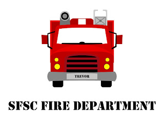
For my final Illustrator project I opted to design the fire truck and fire station. My interest was favoring the fire truck over the kitchen design. It did end up taking me a few hours to create this final project, because it ended up being tedious work.

To start off, I created the fire truck. I managed to do this with all sorts of shapes, both from the shape tools and custom made. One of the hardest parts was making sure everything was scaled correctly to the right widths and heights, because there was no guide placed in Illustrator. Instead, I had to look at the book and get as close as I could through what felt right! Whenever it was possible, I would duplicate the left side of a shape to create the right side, ensuring symmetry.


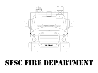
The firetruck was easy to make, but a little bit tedious. I wasn't prepared for how much more tedious the building was going to be. I chose the "New fire station" image to follow, because it had a more head-on angle to go off of. For the most part, I used rectangles to create the shapes composing the building. The sky was created using the rectangular shape tool filled with a "sky" blue gradient. I've included a screenshot of the wireframe for both the firetruck and fire station because I find them to be very pretty and interesting to look at! (The final dimensions on the document were 1700x1400, or around there, so the JPG I have included is at 60% of the original size.)


Illustrator: Twirl Tool: Biker Jacket Mandala

To create the "Mandala" image, I placed an ellpse shape on the artboard and warped it with the "Twirl" tool. I then created a polar grid that I duplicated and rotated the warped shape around to create a mandala.


To create the "MIami Heat" motorcycle jacket image I took the mandala I created and added two text layers created using the Type on a Path tool. I placed the design on top of the motorcycle jacket and lowered the opacity to 50%.


To create the rose image, I placed a polar grid on the artboard and warped it with the "Wrinkle" tool. I duplicated it twice more and rescaled / re-wrinkled each duplicate rose. I placed an ellipse shape on the bottom of the artboard and used the "Twirl" tool to warp it, changing the stroke of the shape to a Chalk brush to give it some texture. I then placed the image on top of the motorcycle jacket and changed the blending mode to "Luminosity".


Illustrator: PEN TOOL 3: Drawing Curves Angel Fish Surfboards

To create the "Angel Fish" image I layered multiple wavy pen tool shapes on top of each other and blended them together with "Gaussian Blur" filters. I created line paths with the pen tool that I filled with green colors and blurred to create the seaweed, then I created the fish using an oval, ellipse, and pen tool shapes filled with radial and linear gradients. The bubbles were made with a light blue to dark blue gradient topped with a white-to-transparent shape layer that was blurred to give them a depth effect. The text was created by converting the type into an outline so I could apply a gradient to it and then a custom clipping mask was created to fit the entire image directly onto the surfboard.


Illustrator: PEN TOOL 2: Tracing with the Pen Tool

To create the "Tartan Mills" logo I imported the original scotty dog image into Illustrator and set it as a template so I could trace the outline of the scotty dog with the pen tool. I took the path I created and pasted it into a new document where I added the text above and below it.


To create the "Tartan Mills Tee Shirt" I opened the image of the gray tee shirt in Illustrator and pasted my "Tartan Mills" logo design above it. I scaled it down to fit onto the shirt, changed it's opacity to 60% and set the blending mode to "Soft Light". I duplicated a version of the logo and scaled it down even further to make it fit onto the clothing tag.


To create the "Crane Airlines Tee Shirt" I opened the image of the blue tee shirt and the "Origami Paper Crane" I created in the previous assignment, added text above the paper crane and then pasted the entire design onto the image of the tee shirt. I set the blending mode to overlay and changed the opacity to 80% before duplicating the logo, changing the colors to completely black, and rescaling it down to fit onto the clothing tag.


Illustrator: PEN TOOL 1: Drawing Straight Lines with the PEN Tool

To create this abstract image I practiced drawing shapes with the pen tool and filling them with various colors, patterns, and gradients while adjusting their opacity.


To create this "Paper Airplane" I made the grid visible above the artboard and created several triangles with the pen tool, moving them above and below each other and filling specific ones with black to achieve the overall image.


To create this "Origami Paper Crane" I created several triangles with the pen tool and filled them with the "Live Paint Bucket" feature. I moved the triangular layers above and below each other to make sure the image looked correct.


Illustrator: Vertical-View Trace Tool

To create the "New York City Poster" I used line segments and curved paths to live trace the outline of a diamond. I filled it with the "Live Paint Bucket" tool and re-scaled it before adding a drop-shadow and changing it's blending mode to "Multiply". I pasted a photo of New York City into the background, duplicated the diamond above it and re-filled the duplicate diamond with white-to-transparent gradients. I added the text in front of a black rectangle set to "Overlay" mode with an outer-glow.


To create the stamp, I placed a small rectangular shape onto the artboard and ran the "Zig-Zag" and "Drop-shadow" filters on it. I pasted my New York City poster above it and re-scaled the poster down to fit into the stamp. I took the liberty of adding a blue radial gradient background and re-scaling the entire stamp up in size to make it more visible (for the purpose of viewing in this blog).


Illustrator: Diamond Solitaire Necklace

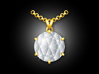
To create the "Diamond Solitaire Necklace" I took the diamond symbol I made in the previous assignment and filled it with gradients using the "Live Paint Bucket" tool. I created various ellipse and rounded rectangle shapes and filled them with metallic gold gradients to create the necklace components. To give the diamond a little more depth I added a circular shape above the diamond and filled it with a radial white-to-transparent gradient and positioned the center of the gradient near the top-left of the shape. Also, I used the star tool to create small 'diamond sparkles' to make the diamond pop.


To create whatever the following is (I didn't have much of a plan, I just wanted to play around and see what I could do!) I duplicated the diamond multiple times and arranged it around the perimeter of the original. I changed the color of the diamond in the original to red and created various 'diamond holders' with metallic gold gradient fills. Also, to give the 'diamond' a little more depth, I added a circular shape filled with a linear white-to-transparent gradient which I blurred with the "Gaussian Blur" filter.


Illustrator: Diamonds! The Polar Grid Tool

To create the diamond symbol I used the Polar Grid tool, coupled with the rectangle and line segment tools.

To create the logo, I set the diamond on a black rectangle and used the type tool with modified tracking. I used the star tool to create the bursting star in place of the "o" in "Diamond".


Friday, June 21, 2013

Illustrator: Clipping Mask: Happy Easter!

To create the "Happy Easter" image I used a gradient to fill the background and created a sun with the star shape tool (with a gaussian blur) and a circle shape above it. I created the bunny using various shape tools and extracting methods while the jelly beans were created with ellipse shapes that were blended together with a white-to-black gradient ellipse shape on top of them that was set to the screen blending mode. I duplicate the jelly beans to fill the bottom of the image and created a text layer with a drop shadow. To finish, I created an oval on a new layer and used it as a clipping mask.


To create the cat I took the bunny I created for the "Happy Easter" image and modified it slightly to resemble the cat. I added feet and a tail, which I created with the ellipse tool and warp filter.


Illustrator: Sketching with the Pencil Tool and Blending

To create the "Pet Rescue Logo" I used the pencil tool to draw the puppy's facial features. I used the smooth tool to make the curves more beautiful and used double ellipses to create the eyeballs. I also used the ellipse tool to create the circular border and typed along a circular path with the path type tool.


To create the "Caladium" I used the pen (rather than the pencil) tool to create a nicely curved caladium leaf. I copied the original leave and created two duplicates, each smaller than the previous and inside of each other, changed their colors and blended them together. I created a dot with the ellipse tool and duplicated it many times before placing it on top of the caladium leaf. I used the pen tool to create the stem and then duplicated the entire leaf (after grouping it together) and changed the colors to make the second leaf a little more unique. I warped the top type and applied an outerglow to it, while I applied a white drop shadow to the bottom type.


Monday, June 17, 2013

Illustrator: Chapter 19: Create Type

To create the "Type" image I utilized the different type tools (such as: type on path, type in area, type on vertical path, etc.) and applied various effects to the text layers (drop-shadow, outer-glow).


To create the "Tickets" images I started with a rectangle and then cut away from it with ellipse shapes. I used the star shape tool to add and distribute some stars on the tickets and gave some of my text layers a stroke. I used different styles of artistic brush strokes to give a textured look to the top two ticket designs.


To create the "Recycled Logo" image I created two ellipse shapes, one inside of the other, and applied a 3 pixel green stroke to each. I used the Type on Path tool to create the text, which was modified with tracking and around the base-line shift. I used the symbols panel to insert the pre-made tree.


Illustrator: Industrial Object

To create the "Industrial Object" image I created a rectangle that I filled with a custom metallic gradient, which I then duplicated and rotated to make a cross ( + ). I then created three circles, each one smaller than the previous, laid them inside of each other, and applied custom radial gradients to each of them to achieve a 3D effect. Lastly, I aligned everything together to create the complete industrial object.


Illustrator: Hearts & Shamrocks: Using Shape Objects to Create Other Shapes

To create the "Happy Valentines Day!" image I used the ellipse & rectangle shape tools to create the shape of a heart. I filled the heart with a radial gradient to give it a 3D effect and then used the filters to add a drop-shadow. I duplicated the heart, changing the opacity and gradient color each time, and scattered each replicate heart across the document. I used the type tool to add the "Happy Valentines Day!" text layer and gave it both a drop-shadow and outer glow.


To create the "Luck of the Irish" image I took the heart template I created earlier and then added the stem by combining the ellipse and rectangle shape tools. I duplicated the object multiple times adding different gradient effects, inner glows, and strokes to give the object a 3D appearance. I used the pencil tool with a brushed stroke to create the texture behind the shamrock and used the same stroke style to create the border.


To create the "Card Suits" image I imported the heart and shamrock objects I created earlier. I used the heart and shamrock to create the spade object and the rectangle shape tool to create the diamond.


Illustrator: Chapter 6: Geometric Objects

To create the shapes image I used various shape tools to draw shapes on the artboard, then I applied various fills and strokes to the shapes to make them each unique. I used the type tool to create the "SHAPES!" text layer, applied a black stroke to it, and added a drop-shadow through the filters menu.


To create the Oedipus Rex image I used the spiral / line / rectangle shape tools to create the column. I horizontally distributed the vertical column lines and grouped the entire column together to move it as one object. I used the type tool for all text layers and applied a drop-shadow to "Oedipus Rex".


To create the Annual Spring Luncheon image I created two rectangles with strokes to fill the background. I used the pencil tool to draw the leaf, using the smooth tool to smooth the edges. I duplicated the original leave to create the left column of leaves and used the spiral tool with the "Pucker and Bloat" filter applied to create the flower. I applied a drop-shadow to the flower and leaves beneath it.


Sunday, June 16, 2013

Photoshop: Restoring Old Photographs & Actions

The example marriage certificate in the assignment document is no longer available online, so I chose a different marriage certificate to work with - one that I thought would still be a challenge (since the one in the example seemed like it would take some work also).

To fix the marriage certificate:

  1. I began by using the healing brush and clone stamp tool. Once I got a decent-sized patch of good (fixed) texture, I used that patch as the source for the rest of my clone stamp brushing throughout the certificate (long and tedious process).
  2. Once I finished fixing the crinkles I desaturated the document and altered the brightness / contrast to make the words stick out better against their background.
  3. I ran the "Unsharp Mask" filter and then the Sepia toning in the actions panel.
  4. Lastly, I scaled down the certificate and ran the sharpen filter, which I then faded to 30%.

Before:


After:


Photoshop: Smudging Colors, Filters, Layer Effects

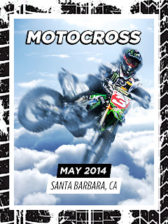
I took this image in a different direction than the rules as in some of the previous Photoshop assignments.

To create this image:


  1. Created a 600x800 pixel document.
  2. Found and pasted an image of a beautiful, cloudy sky into the document.
  3. Found an image of a dirt bike rider and used the quick selection tool + refine edges tool to extract him from his background.
  4. Pasted the image of the dirt bike rider into my main document.
  5. Carefully positioned the rider into the correct area and then used the curves tool to lighten him to match the sky.
  6. Duplicated the rider, selected the original layer, and then used the smudge tool to create a motion effect.
  7. Used the hue/saturation tool to adjust the smudged rider to a blue hue.
  8. Added a layer mask to the duplicated rider (top layer) and masked some the bike off to blend into the smudged layer.
  9. Used the type tool to create the text layers, adding a deep drop-shadow to the "MOTOCROSS" layer.
  10. Used the rectangle shape tool to create the black and white slanted backgrounds behind "MAY 2014" and "SANTA BARBARA, CA".
  11. Increased the canvas size to 120%.
  12. Used the rectangle shape tool to create a white border and a black background.
  13. Found an image of a dirt bike tire track, ran the Posterize filter on it a few times, and placed on top of the black background to give a textured border look.

Image:


Photoshop: Book Cover > Filters and Shape Tools

I took the following steps to create these images:


  1. Opened the provided lake image and used the patch tool to remove the watermark.
  2. Pasted an image of an old map of Maine into the document and used the Path tool to create a selection of the sky, which I used to apply a layer mask to the map image.
  3. Merged the document, converted for Smart Filter use, and began applying filters to the image (images posted below).


To create the book cover:


  1. Created a 7"x9" document.
  2. Pasted my favorite filtered lake image into the document.
  3. Resized the image to fit into the width of the document.
  4. Used the shape tools to create the red band, blue background, and yellow oval shape.
  5. Used the type tool to create the text layers, to which I added drop-shadows.


Images:


Diffuse Glow:


Paint Daubs:


Tint Drawing:


Saturday, June 15, 2013

Photoshop: Layer Masks

I took the following steps to create this image:

  1. Used the patch tool to remove the watermark on both of the provided images.
  2. Moved the tile layer into the window image document and cropped the document's height.
  3. Created a path out of the shape of the window and added an inverted layer mask onto the tile image.
  4. Changed the layer mode of the tile image to Pin Light, lowered the opacity and lowered the saturation.
  5. Pasted an image of Marrakech into the document and created another path-to-selection to layer mask the city into the window.
  6. Used the type tool to create the text, to which I added a low-opacity stroke and light outer-glow.

Image:


Photoshop: Working with Selections

I created this image with the following steps:


  1. Opened the image of the kumquat and used the quick selection tool to select some of the kumquats and the surrounding leaves.
  2. I used the "Refine edges" tool to smooth out the selection, which I then copy and pasted into a 650x650 document.
  3. The bottom leaf was cut off (in the original image) and the top leaf was covered partially by a watermark - so I used the clone stamp tool to cover the water mark and then copied the top leaf and pasted it in a layer below.
  4. I vertically and horizontally flipped the pasted leave and moved it underneath the bottom (cut-off) leaf. I then used layer masks and smudging to make it look like a complete leaf.
  5. I merged all leaf/kumquat layers into one and converted the layer into a smart object, which I then scaled down.
  6. I duplicated the scaled down version, created a new layer and merged them together (to remove the 'smart object' attributes of the layer), scaled the layer down vertically, desaturated, and applied a gaussian blur to - to create a shadow effect.
  7. I filled in the document with the necessary text layers.
  8. I increased the canvas size to 120% and used the rectangular shape tools to create an orange border and green background.


Image:

Photoshop: Blending Images

Two-for-two! I'm enjoying this Photoshop section of the course very much, could I be biased? :) I enjoyed this project for two reasons:

  1. It was simple.
  2. The result was a clean, beautiful, and appealing image (in my opinion, at least).

The steps I took to create this image:

  1. Found three images of Lisbon on Google Images.
  2. Created a 600x300 and pasted each of the three images into it, scaling them down to fit just above the height constraints of the canvas size.
  3. Moved one image to the left, one image to the center, and one image to the right side of the document.
  4. Added a layer mask to the left side layer (it was above the centered layer in the layer stack) and used the black-to-transparent gradient tool in the layer mask to achieve a smooth transparency blend.
  5. Used the same technique in the center layer (which was above the right side layer in the layer stack) to blend the right side of the center layer into the right side image.
  6. Created the "LISBON" type layer, centered it both vertically and horizontally, control+clicked the layer, hid the layer (clicked the eye next to it in the layer panel) then pressed control+shift+C to copy merged and pasted the contents above the type layer.
  7. Used blending options on the newly pasted layer (which resembles a cut out of the type layer filled with the background image) to add a low-opacity white fill, a sharp inner glow (looks similar to an inner stroke) and a black drop-shadow.

Image:


Photoshop: Fading Type & Hand-Painted Borders

Personally, I found this graphic project to be the most enjoyable of the course so far. Because of my cheerful attitude towards it, I chose to go off the beaten path and make it a little more complex (and [hopefully] a little more beautiful] than by just following the directions. I hope you don't mind (Dr. Stevens)!

I'll try to keep the how-to as brief as possible since I could go on and on about it.

The steps I took to create this image:

  1. Created the 800x600 pixel document and filled it with a white-to-blue gradient.
  2. Selected a soft white brush and then modified the size, scatter, and shape dynamic settings to create a 'cloud' brush which I then painted over the background with.
  3. Found a PNG version of a hot-air balloon (why not find one that has already been cut out when they are available? :) ) and then pasted it into the document.
  4. Blurred the bottom portion of the hot-air balloon to give it a softer, more realistic feel.
  5. Added the "30th Annual Hot Air Balloon Festival!" type layer and used the blending options to give the text a blue fill, white stroke, and drop shadow.
  6. Added the "May 3-4" type layer and used the blending options to give it a slight bevel & emboss (hard to see, but is there) and a drop shadow.
  7. To achieve the white glow/gloss effect on the "May 3-4" and "BALLOONS" type layers I control+clicked the type layer (to select its contents), created a new layer and used the soft white brush tool to brush a gloss in the top half of the selection. I deselected the contents and then applied a small gaussian blur to the new (white-brushed) layer.
  8. At this point, I increased the canvas size to 130% on both width & height.
  9. I created a new layer and dragged it to the bottom of the layer stack. I then filled the layer with a slightly darker blue than in the original image.
  10. I used the same technique as before to brush clouds into the new background.
  11. Instead of adhering to the boxy constraints of the assignment, I created a new layer and used the pen tool to make a rounded shape that enclosed the hot-air balloon, "30th Annual Hot Air Balloon Festival" type layer, and "May 3-4" type layer. I grouped the two original background layers  into a folder (the white-to-blue gradient and cloud layers), control+clicked my newly created shape, and then (with the background folder highlighted) clicked the "Add a layer mask" button, which masked my square background into the rounded shape.
  12. I clicked back on the shape layer and selected its blending options. I lowered the layer's fill opacity to 0%, but added a large, white drop-shadow to make the original image 'pop' off of the background.
  13. Then, I created the "BALLOONS" type layer. I used the blending options to add a blue-to-white gradient stroke, a sharp bevel & emboss, and a drop-shadow. Then I used the type warp tool to give it a flag wave effect. I created the white glow / gloss layer as mentioned above.
  14. I rasterized the type layer, control+clicked on the hot-air balloon layer, inverted the selection, and (with the "BALLOONS" rasterized layer active) clicked the "Add layer mask" button to make the "BALLOONS" type look as if it was behind the hot-air balloon.
  15. Lastly, I duplicated the hot-air balloon and moved the duplicated layer to the top of the layer stack. Then I resized it larger (which degraded it's quality) and applied a gaussian blur (to give the image depth and to hide the lost quality of the resized hot-air balloon).
  16. I used all these techniques to try to create something a little more original and attractive with a little bit of creativity, I hope you like it!


Image:

Wednesday, June 12, 2013

Photoshop: Appendix A & B


FROM APPENDIX A: Project Planning Guideline

List and briefly describe the 4 project planning guidelines:

  1. Determine the Project’s Purpose: Clearly define why you are undertaking the assignment.
  2. Analyze Your Audience: Learn about the people who will use, analyze, or view your work.
  3. Gather Possible Content: Gather existing images and photos, or design new graphics based on information that may reside in spreadsheets or databases.
  4. Determine What Content to Present to Your Audience: Write three or four major ideas you want an audience member to remember after viewing your project. Envision your project’s endpoint, the key fact or universal theme that you wish to emphasize.

FROM APPENDIX B: Graphic Design Overview

Define the following terms regarding GRAPHIC DESIGN (terms are listed in alphabetic order):

  • Balance – Symmetrical balance: The left and right halves are mirror reflections. Asymmetrical balance: A small, dark element with a large, light element or one large element with several smaller elements.
  • Closure – Composing objects from small parts and spaces.
  • Continuance – When a viewer’s eyes move across a page and keep moving.
  • Contrast – The visual differences between elements.
  • Device dependency – When the appearance of a web page depends on the device (computer, cell phone, or PDA) on which they are viewed.
  • Dominance – The element to which a viewer’s eyes and attention usually move to first.
  • Negative space – The space in your design that does not contain information, or the space between elements.
  • Pixel – Smallest element of a digital image.
  • Proximity – The relative space between elements.
  • Public-domain images - Images that are completely free to use.
  • Repetition – Repeating a visual element to tie a design together.
  • Resolution – The number of pixels displayed on a computer screen.
  • Royalty-free images – Images that can be reused without paying additional fees.
  • Stock art – Artwork and photographs that can be licensed for use.
  • Unity – The concept that all elements within a design work well together to form a whole.
  • White space – Negative space.

Define the following terms regarding COLOR TERMS (terms are listed in alphabetic order):

  • CMYK color - Mixes physical cyan, magenta, yellow, and black pigments (such as ink) to create other colors, and is used in printing.
  • Color relativity - A colors lightness/darkness value.
  • Color scheme: Analogous - Uses colors next to each other on the color wheel.
  • Color scheme: Complementary - Uses colors directly across from each other on the color wheel.
  • Color scheme: Monochromatic - Uses a single hue with a variety of shades and tints.
  • Desaturated colors – Produce mellow tones and evoke calm feelings.
  • Hue – The tone, or actual color, such as red, yellow, or blue.
  • L*A*B color – Combines levels of lightness with two color channels.
  • RGB color – Mixes red, green, and blue light to create other colors.
  • Saturation – The intensity of a color.
  • Shade – Mixture of a hue and black, producing a darker color.
  • Tint – Mixture of a blue and white, producing a lighter color.
  • Value  - Describes a color’s overall lightness or darkness.

List what emotions are often associated with these colors:

  • Black – Evil, death, or mourning, but also mystery, intelligence, elegance, and power.
  • Blue – Calmness and serenity. Authority, stability, loyalty, and confidence.
  • Green – Growth, tranquility, luck, money, and health, but also jealousy.
  • Red – Love, passion, and comfort, but also sin, hell, and danger.
  • White – Cleanliness, purity, and hope, but also death and mourning in some Eastern cultures.

List 5 factors that contribute to the readability of text:

  1. Large text passages written in lowercase are easier to read than long text passages in uppercase.
  2. Regular text is easier to read than italicized text.
  3. Black text on a white background is easier to read than white text on a black background.
  4. Legibility affects readability.
  5. Line length, letterforms, and appearance all influence readability.

Explain the responsibilities of the CLIENT in the client/designer relationship:
The client must clearly communicate the needs of the project, provide timely and constructive feedback, trust the designer’s expertise, and pay the bills on time.

Explain the responsibilities of the DESIGNER with regard to customer service: 
The designer must be on time to meetings, meet or beat their deadlines so they don’t submit work late, treat their clients and their time and their money with respect, be able to explain their design choices, and ensure adherence to copyright law.

PUBLIC DOMAIN PHOTO SITES: Appendix B (page 22) mentions several sites where you can find PUBLIC DOMAIN PHOTOS, including Flickr, Morgue Files, and Uncle Sam’s Photos. 

Uncle Sam’s Photos:  http://www.unclesamsphotos.com/ 
On the home page, you will see several categories of images. Click on the SCIENCE category. Find an amazing image of the EARTH FROM SPACE and insert here:


Morgue File:  http://www.morguefile.com/
Search for a beautiful image of a TALL SHIP and insert here:


Flickr:  http://www.flickr.com/
Search for a colorful image of a FLORIDA PANTHER and insert here: